From a customizable version of the Call-To-Action button, through making the chat more fun with emojis, up to useful Breakout room labels – we have rolled out a set of six new features you can now put to action. Why do they make a difference? Let’s take a closer look!
Entice your audience with a custom CTA
With the latest version of our CTA button, you can do more to draw people’s attention. You can now add your logo, brand photos, or other graphics that will present your offer in a more appealing way. Forget about plain text! Compelling visuals will do the trick!
Get rid of the distractions with the Mute all button
Sometimes running a virtual get-together with a group of 25 students or teammates can get out of hand when everyone starts talking over each other.
With the latest ClickMeeting’s product upgrade, it’s not going to happen again. All you will need to do to silence everyone in the event room is clicking one Mute all button.
Naturally, only hosts and presenters can use this option.
Let your audience show their emotions – emojis in the chat window are on
Sometimes a single icon speaks louder than thousand words. We are all used to expressing our emotions with emojis – every day. For all of you, who have been letting us know that we should implement emojis in the chat window, we have good news – it’s on!
From now on, all people gathered in the event room can play around with emojis and make your events more fun and engaging.
Switch to a speaking view to take the lead
If you meet online with your colleagues or students, there might come a time to put you as a presenter in the event room’s center. With this product change, you gain super easy access to changing between a gallery and a speaking view.
All you need to do to enlarge the current speaker window is clicking the Speaking view button at the bottom of the event room.
Pin your AV view window to the bottom of the event room
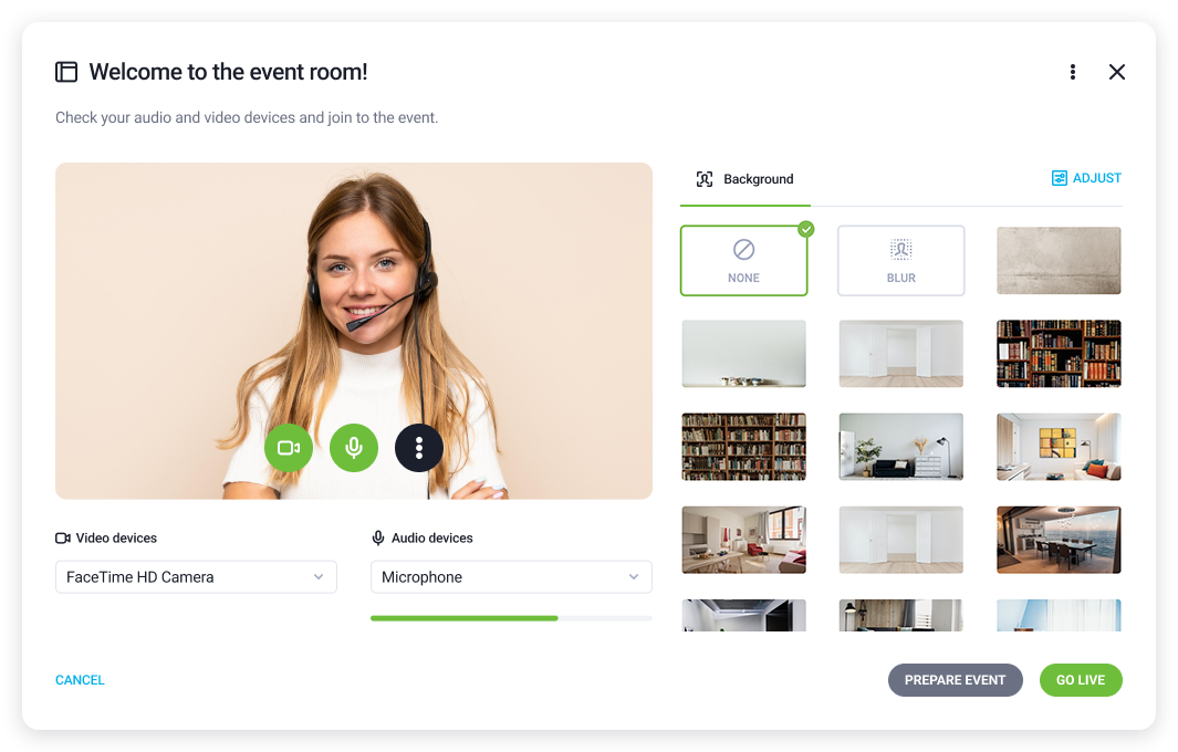
Many people, especially during long online meetings, prefer to look at other attendees’ faces rather than seeing a mirror reflection.
That’s why we introduced the option allowing you to pin your Audio Video window to the bottom of your event room. A window where you see your face will be smaller to create more space for other event attendees.
Know your Breakout room at glance with new labels
Last but not least, there is a super handy change in the way Breakout rooms work. Splitting your online event into smaller rooms is a milestone, but it could be difficult for you to know in which Breakout room you are at the moment.
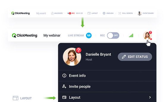
To make things a lot easier and comfortable, we are introducing the Breakout rooms label. From now on, whether you are in the main room or any other smaller room, you will see a proper label with a relevant name at the top.
So, that’s it! Six upgraded features ready for you to check out.
Login to your account and play around with these new tools!
